How to Make a Surface Pattern Design Look Professional

Have you heard the phrase "practice makes perfect?"
Were you ever told you have to make 100s of patterns before becoming good at surface design?
And both these may statement are true... but they are missing a key bit of information.
Making repeating patterns is not different from any other art form, like painting and music; surface design is as much an art as it is a science!
So, to make your surface pattern designs look good, you have to keep in mind a few design fundamentals.
And once you start implementing these elements listed below, you will be able to practice with propose, make your work stand out, and even build a winning portfolio much faster.
Does that sound good? So let's get right into it!
Good Shape Variety
Imagine looking at a bouquet with flowers arranged in various sizes, from big, bold flowers to medium and tiny buds. The variety of size and shape of the flowers is a good example of shape variance.

William Morris Wallpaper
Adding shape variance can make a pattern interesting and dynamic, and it is very simple to incorporate into your designs; when creating your patterns, try to divide your elements into these 3 main categories:
Hero shape
She is the biggest and most detailed and is usually the focal point of the pattern.
Medium support shapes
They are smaller shapes with slightly fewer details. I usually add more support shapes than hero shapes in a pattern since they are smaller and less complex; they won't steal too much attention from the heroes even if there is more of them.
Tiny fill shapes
Filler shapes are small and abundant. You can use them to fill in gaps between the bigger elements and add little accents and details to areas that feel empty.
Of course, there are times when you want all your shapes to be the same size. Going back to our flower reference, there are times where a bouquet of daisies or roses if or example s very impactful and appropriate on its own. However, a more complex bouquet arrangement might steal the limelight!
Pleasing Color Palette
When it comes to making patterns, color can be one of the most important elements of your design. Colors set the mood, evoke emotions and can even help you travel to a different time.
There is so much that goes behind picking a good color palette that I had to dedicate an entire blog post to the introduction to color theory, but here are some helpful types of Color Palettes to get you started:
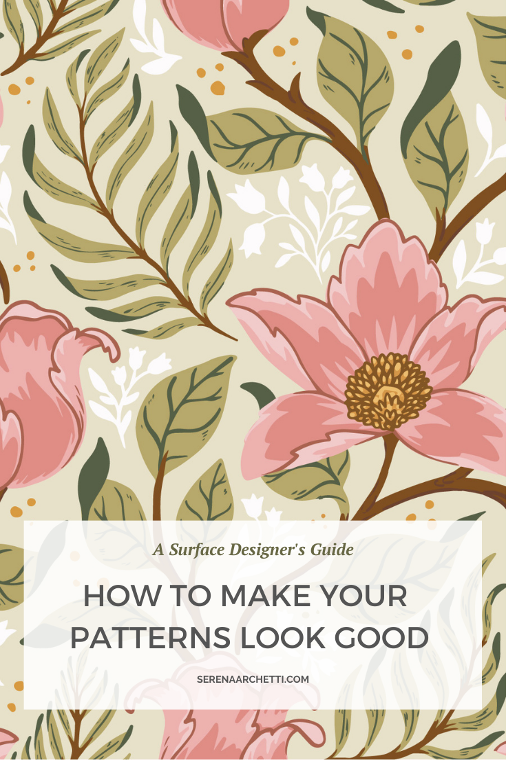
Complimentary
You can make a complementary color palette, by picking any 2 colors that are opposite to each other on the color wheel.
Limited Palettes ( Monochromatic + Analogous )
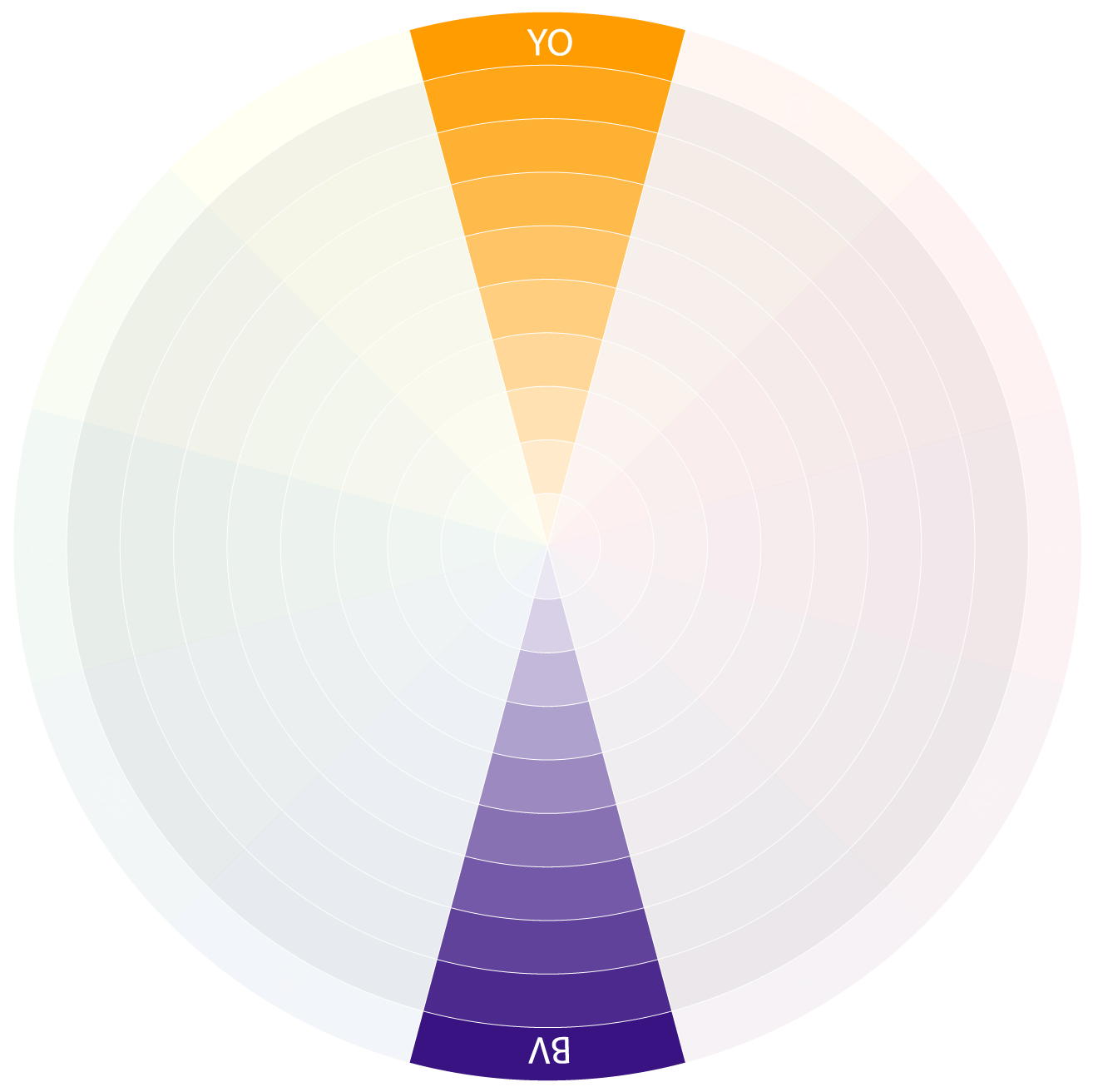
Monochromatic

Monochromatic color palettes and use one hue (color) with different levels of saturation and lightness.
Analogous
Analogous Palettes use only hues that are next to each other on the color wheel.
Split Complimentary
Split Complementary color palette use two analogous colors plus one contrasting color (opposite side of the color wheel), creating an interesting accent.
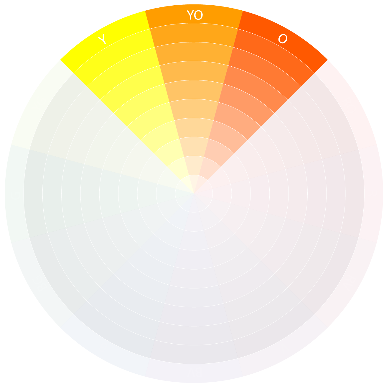
Triadic
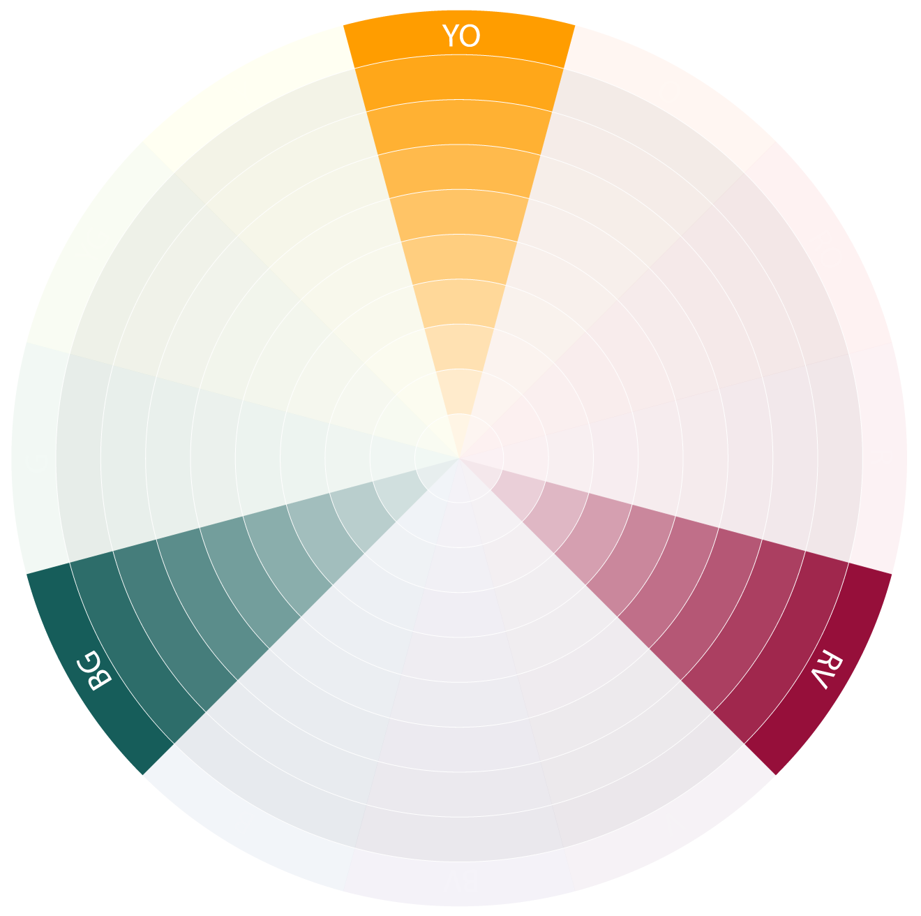
Triadic uses 3 colors evenly spread out on the color wheel. It is a bit trickier to use because you have to maintain balance between all the colors.
Balancing Colors
Once you have your colors palette ready, you can use this simple set of guidelines to help you balance the colors in your pattern:
Primary color:
This should take up most of the area of your design. Sometimes the background color will be your primary color if the pattern elements are small or spread out
Secondary colors:
Secondary colors can take up less than half the area of your design, although they are still quite evident.
Accents:
Accent colors take up only a tiny area of your pattern but they can be powerful. Because they are so small they can be pretty contrasty and bold.
One last tip for picking colors is to always look around you and noticing what colors resonate with you. When I was studying concept art, my mentors would always say: Nature is the best designer, so when you are out and about, keep your phone at hand and snap lots of photos of nature to use as a reference library.
Good Contrast
You might have heard before that contrast is a critical element in surface designs and art in general. But what is it really? Why is it so important? And what if I told you that good contrast has nothing to do with "colors" at all?
As it turns out, the part of our brain that distinguishes shapes, edges and 3Dimensional forms sees the world in black and white. And it is this part of our brain that loves and craves good contrast!
Weird right?
I'm not a neuroscientist, so I don't know precisely how this process works, but Margaret Livingstone wrote an entire book on this subject: Vision and Art The Biology of Seeing, which is insightful, fun, and luxuriously geeky. I highly recommend it.
For now I can give you a fun experiment to show it in action.
Looking at Image 2 below you can see a well-defined circle inside a square. Next to it, image 1 is the same image with all its contrast removed.
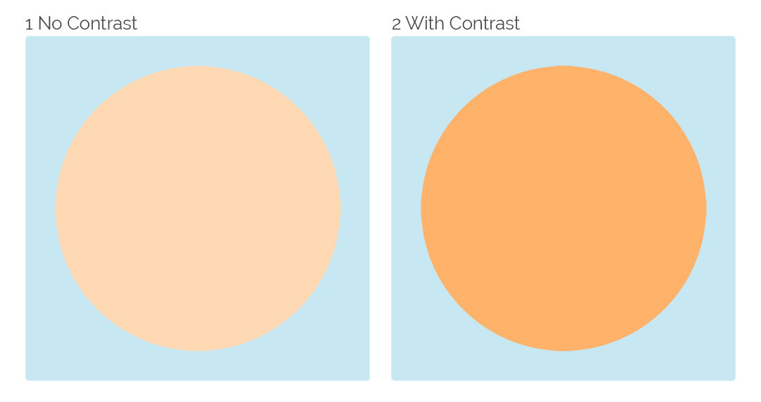
You may notice that if you stare at image 1 for a few seconds, it can feel unpleasant. It might even look wobbly and as if it is moving on its own.
This wobbliness is caused by our brain not being able to place the object in space accurately because the values of the shape and background are too similar to each other.
Wait, so what is Value?
In a few words, value is how light or dark a color is.
You can see their true value without being distracted by colors we can desaturate to see them in black and white.
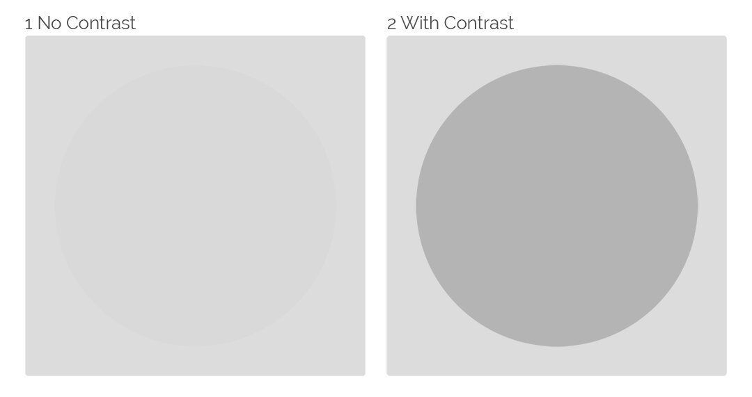
Now we can see, it's nearly impossible to distinguish the circle in picture 1.
The orange and blue colors are now the same shade of grey. This is why it looked wobbly before; the part of our brain that places things in space sees in black and white, and it was struggling to find the edge of the circle.
Meanwhile, in picture 2 the circle is a nice shade of darker grey, making it look defined, solid, and easy to read.
A nice little trick to check the contrast of your repeat patterns is to turn them to black and white and see if they are still working well.
Quality Execution
If you are just starting out, you can focus on honing your skills and always try to make your next pattern better than the last.
Slowly with repetition and care, you will build experience, knowledge and skills with your art medium. There is no shortcut for this one. Just be kind to yourself, appreciate where you are now and focus on healthy growth.
Consistent Style
Style can feel elusive and constantly out of reach. To find your unique style sometimes can feel like setting off in the search for some elusive magical creature.
And yet, it doesn't have to be so hard!
Style at its essence is simply a series of choices.
Every time you make a pattern, you make all of these choices already, sometimes on purpose and sometimes by accident perhaps. But they always all add up to a "style".
So what are these choices?
To keep it simple, these choices are how you decide to handle the "elements of style" which can be roughly divided into these categories:
Line
Color
Shape Language
Subject Matter
Now, if it sounds so simple, then why is finding a style so flipping hard?
Well, deciding how to handle these elements while working on a specific pattern might be easy. But finding something you can stick with for a very long time is indeed difficult, like picking a home, you cant just get the first one you see. You are going to have to live with it for a very long time.
If you are just getting started with surface pattern design, experimenting and trying new mediums, techniques and themes will help you find what you love to make.
But if you are working on a Collection or portfolio where your designs are to be used and displayed together, sticking to only a few of these techniques you have learned through experimenting will help you keep your style consistent.
The good thing is as you can move out of a home, your style can also evolve and change with time, so no decision is truly final. So don't let the fear of cornering yourself into a style stop you from making a choice. You will have plenty of time to try new things in the future.
An Appealing Theme
This last one is very subjective and heavily influenced by your niche and personal taste. Appealing could be anything from baby duckling to hangry skulls, depending on your target market.
Understanding your niche and what your clients like is essential as a surface designer. Because like any other profession, surface pattern designers provide a service.
We create beautiful art, which fulfils a need and is highly marketable.
And as for all businesses, if we fail to provide a good service, we won't sell or licence our products.
So what can you do to make sure you provide a good service?
Study trends, and think about how you can add your own artistic spin to them. Keep an eye out for colors, themes, motifs and inspiration that matches your niche. At the same time, don't fall into the trap of making popular designs just because they are popular. You want to build a brand image and be yourself as much as possible.
Making an avatar of your ideal client can also be very useful and fun. Think about how you can give them what they might need, or want, make art that both you and them will love.
When I started with surface design, I was completely focused on learning to use Illustrator, and the whole technical aspect of this craft alone was overwhelming.
And once the technical side started to become more manageable, and I thought things would be smooth sailing from then on, I quickly realised there is more to making a good pattern than drawing a few elements and putting them together.
But I also discovered that the more I learned about the theory aspect, the more I became passionate about learning and finding out how to create patterns and designs that my audience and clients will love.
It's true; remembering all of these elements can feel like a lot, but it isn't as troublesome as it seems.
In the end, the key to making a good pattern is this: make conscious choices. Apply just one of these tips in this blog post at a time, and once you feel confident with one, add the next, and the next and so on.
Set a goal to make each new pattern 1% better than the last. Don't rush. Take your time and create something you are proud of.
Soon you will be so confident using these guidelines they will come naturally to you. And you will be able to focus fully on creating and letting your creative vision shine through your work.
Want to learn to create your own patterns?
Save this post for later: