Introduction to Color Theory for Artists
You've picked up a brush, and you're about to add the base colors to your latest masterpiece. But then you hesitate. What color should you use?
Most people choose colors based on trial and error or gut feeling, which doesn't always give the best results. But what if there was an easier way to select the colors for your paintings? A method that takes the guesswork out of choosing colors, and instead gives you a systematic way to create stunning harmonious color schemes every time.
Well, there is such a thing. It's called color theory.
On top of finally saying goodbye to the color picking struggles, you will find that understanding color theory can help you improve your skills, create more successful pieces, and even help you sell more art.
Color theory is a science, and it might seem like a scary topic - I used to feel like there was just too much information to remember that, the more I read about it online, the least I understood about it!
But, I promise you, if you're reading this, you can understand the basics of color theory. In this article, I'm going to break it down for you and make it as easy to understand and remember as possible.
So, let's get started!
What is Color Theory for Artists?
As artists, we use color theory to make sure our artwork looks visually appealing, communicate ideas, messages, and stories. But color theory at its core is about the physics of light, and how our eyes and brain processes it.
Simply put, the definition of color theory is a system to understand what colors are, how they interact with one another, how they can evoke different emotions and meanings, and how we can use them to communicate visually.
This blog post will mainly focus on the artistic applications of color theory and not the scientific side of things.
If you're interested in learning more about the science of light and color, I suggest checking out this book from Margaret Livingstone: Vision and Art: The Biology of Seeing.
How We See Colors
Before we get started, it's important to understand how we see colors.
Light is energy, specifically within the range we call visible light on the electromagnetic spectrum. This spectrum is made up of many different wavelengths we see as colors, with violet at one end and red at the other.
Each wavelength corresponds to a specific frequency that our eyes can detect. When these frequencies hit our retina, our brain interprets them and sees them as different colors.
Our eyes have two types of cells that help us see: rods and cones. Rods are responsible for our vision in low light conditions, and they don't distinguish between different colors. Cones, on the other hand, are activated in well-lit situations, and they help us see color.
We have three types of cones that each responds to a different wavelength of light: short (S), middle (M), and long (L) cones. When the three types of cones work together, they create what we see as color.
Each type of cone responds to a specific range of colors, and by combining the responses of all three we can see the whole spectrum of colors.
The figure below shows the wavelength each type of cone is sensitive to:

Wavelengths each type of cone is sensitive to,
As you can see, the S-cones are most sensitive to short wavelengths (blue light), M-cones are most susceptible to middle wavelengths (green light), and L-cones are most sensitive to long wavelengths (red light).
When all three types of cones are stimulated equally, we see the color white. And when they're not stimulated at all, we see the color black.
All other colors are a combination of these three primary colors.
So, the definition of primary colors is colors that can't be created by mixing other colors together. This means all other colors are a mix of two or more primary colors.
By combining all three primary colors in different strengths, we can make up all the color combinations detectable by humans. In fact, there is up to an amazing million colors we can see by adjusting how much red, green or blue is within the light.
How Objects Get Their Color
Now we know how our eyes see color, but how you might ask do objects get their color? When light shines on an object, it will absorb some light in specific wavelengths and reflect the rest. The waves that reflect into our eyes make up the colors we see.
For example, if you shine a bright light on a red apple, the apple will absorb all colors except for red, which will be reflected and travel to our eyes, making the apple look red.
Additive and Subtractive Colors
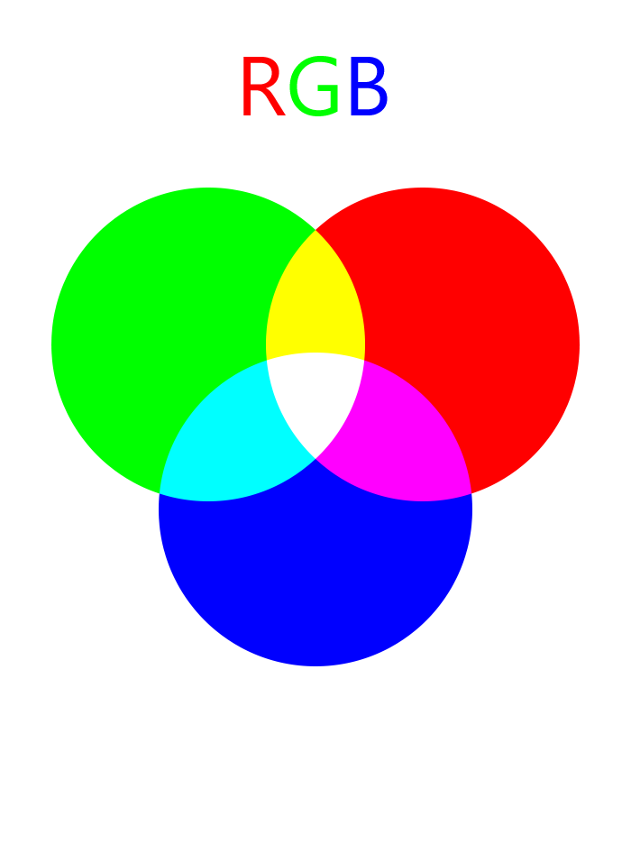
When light is emitted from a light source and enters our eyes directly, the wavelengths will add up together to become brighter and brighter. We call this process Additive.
In the image above, we have three flashlights of the primary colors RGB. When we crossover the different colored lights, they create a brighter light of a new color. And if we add red, green, and blue together, we now have all the wavelengths hitting our eyes simultaneously, creating white light.
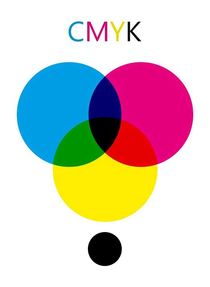
On the other hand, subtractive colours are what we see when light hits an object and is reflected into our eyes. The colors we see are the colors that the object has not absorbed. Mixing primary colors creates darker secondary colors and so on, until eventually when all the colors are mixed equally, we will get black because it's no longer reflecting any color.
A Little Bit About the Color Wheel
If you have ever taken an art class, you would have come across the color wheel. A color wheel is a visual tool that artists use to help understand color relationships.
There are many different types of color wheels, each with its own purpose. So, it can be confusing to navigate all the options and choose the right color wheel for your project, but don't worry, we will go over the purpose of each of them and see their strengths and weaknesses together.
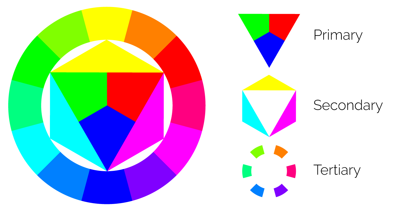
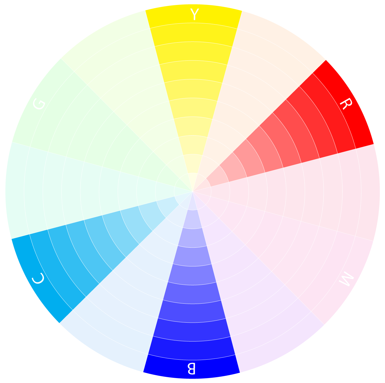
Anatomy of a Color Wheel: Primary, Secondary and Tertiary Colors
All the color wheels share the same basic structure. It is essentially a circle with the primary colors placed at equal distances around the circumference, the secondary colors, sit at the halfway point between primary colors, and the tertiary colors between each secondary and primary color.
You might have also noticed that the RGB has different primary colors from the CMYK and the RYB color wheel, this is because the RGB color model uses light while the others are exclusively for printing inks and pigments, which require a different set of primaries to work correctly.
The RGB Color Wheel
The RGB color wheel is the most commonly used in digital media. It consists of the three primary colors for light, Red, Green and Blue. When mixed, they create all possible wavelengths that we can see. Making it perfect for working with digital media as you can create any color imaginable by adjusting the levels of each primary color.
Best for:
Digital Art and Video
Strengths:
It is mathematically correct in the actual world. And because it's based on how the eyes function rather than how pigments mix when combined, RGB wheels may produce more appealing color harmonies than other color modes.
Weaknesses:
Because the colors are so pure, they can appear oversaturated and hard for us to visualise and interpret into art.
The RGB color wheel is also an additive color wheel that can be a little confusing for artists with a traditional art background, starting with digital media, as they might be more used to the RYB color wheel.
The CMYK Color Wheel

The CMYK color wheel is used in the printing industry and is made up of the four primary colors for pigment, Cyan, Magenta, Yellow, and Key (Black), these are the four colors that, when mixed, create all possible colors. Black is added as a primary color because CMY can't make pure black when mixed because they are usually not pure enough pigments.
Best for:
Printing
Weaknesses:
There is no international standard for CMYK pigments, and different countries can use different standards from each other
CMYK is a limited palette and cannot show all colours within human vision, so you will have fewer colors to work with
The Traditional Pigment Color Wheel
The RYB Color Wheel is the oldest of the three and has been around for centuries, making it familiar to most artists. It starts with the three primary colors for paint, Red, Yellow and Blue. And although this color model is probably the most used, it does come with some flaws that you might want to keep in mind if you decide to use it.
Best for:
Painting
Strengths:
Well known, it has lots of resources to help you use this color wheel.
Weaknesses:
The Colors are based on old science and are spaced unevenly across the color wheel, making it harder to create good harmonies. The warm colors are usually predominant, and the cold tone can be pretty dull.
Colors are not set in stone. Different paint manufacturers can have slightly different pigment variations, so it's hard to achieve accurate color mixing.
The YURMBY Color Wheel
Invented by Toby Sandford, this wheel mixes CMY and RBG to create an accurate color model that is easy on the eye, unlike the RGB wheel! I learned about this wheel from the fantastic book "Color and Light" by James Gurney, another recommended read for all artists who want to delve deeper into color theory.
Best for:
All-rounder
Strengths:
Combines RGB and CMY to create a universal wheel, which is accurate and easy to use.
Color Schemes
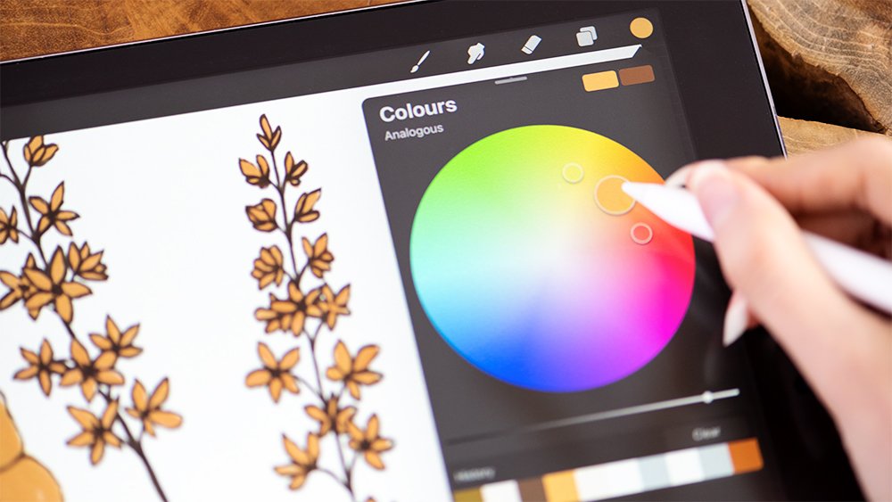
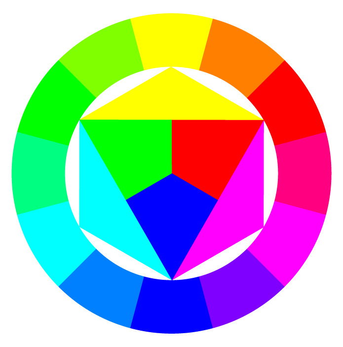
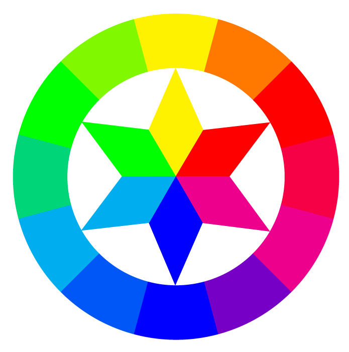
When it comes to color theory, color schemes are a fantastic tool that takes most guesswork from picking great color combinations. At its essence, a color scheme, also known as color harmony, is a group of colors that work together to create a pleasing look, evoke a feeling or guide attention. There are many different color schemes that you can use. The most popular ones are monochromatic, analogous, complementary, triadic, split complementary and double complementary color harmonies. Let's take a closer look at each one.
Monochromatic Color Scheme
A monochromatic color scheme uses only one color. And although this might sound limiting, it can be a really great way to create some beautiful and impactful designs. Using different shades, tints, and tones of the same color, you can create an elegant and simple, cohesive look. But be careful. It can be a little boring if not used correctly.
Analogous Color Scheme
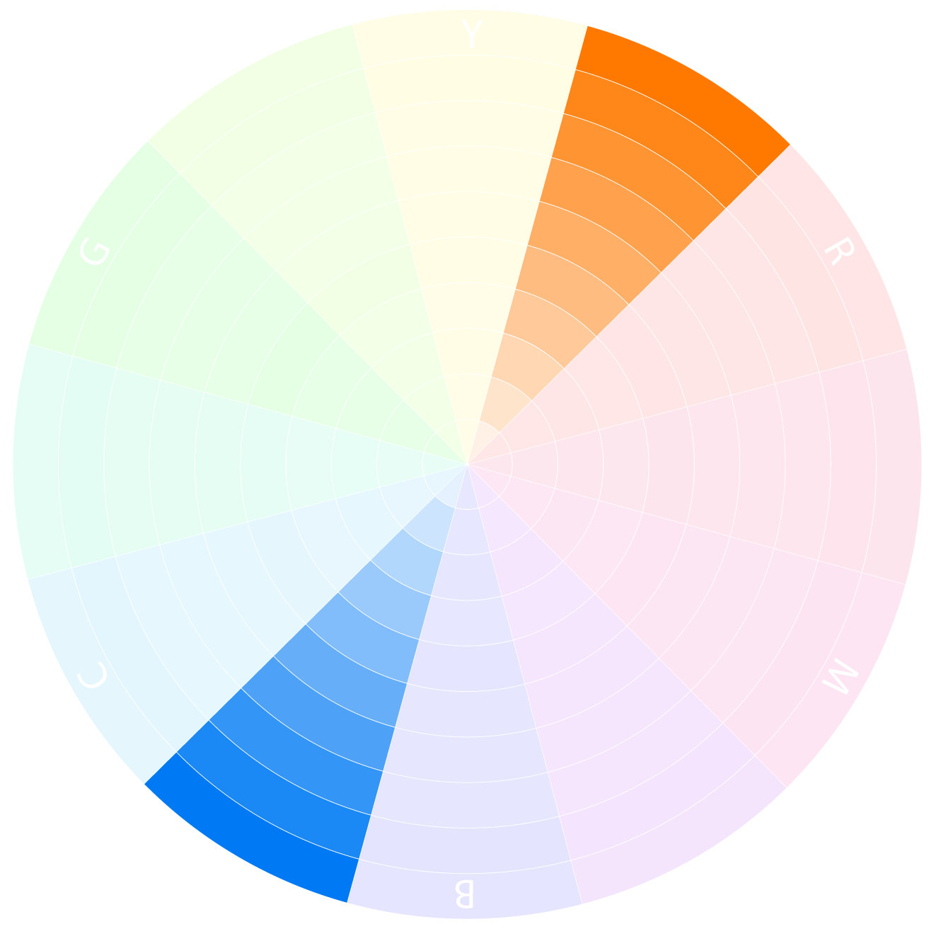
The analogous color scheme is a color scheme that uses colors that are next to each other on the color wheel. This type of color harmony is usually quite pleasing to the eye, as it creates a natural flow from one color to the next. The key to using an analogous color scheme is to use one color as your dominant color, and the other colors as supporting colors.
Complementary Color Scheme
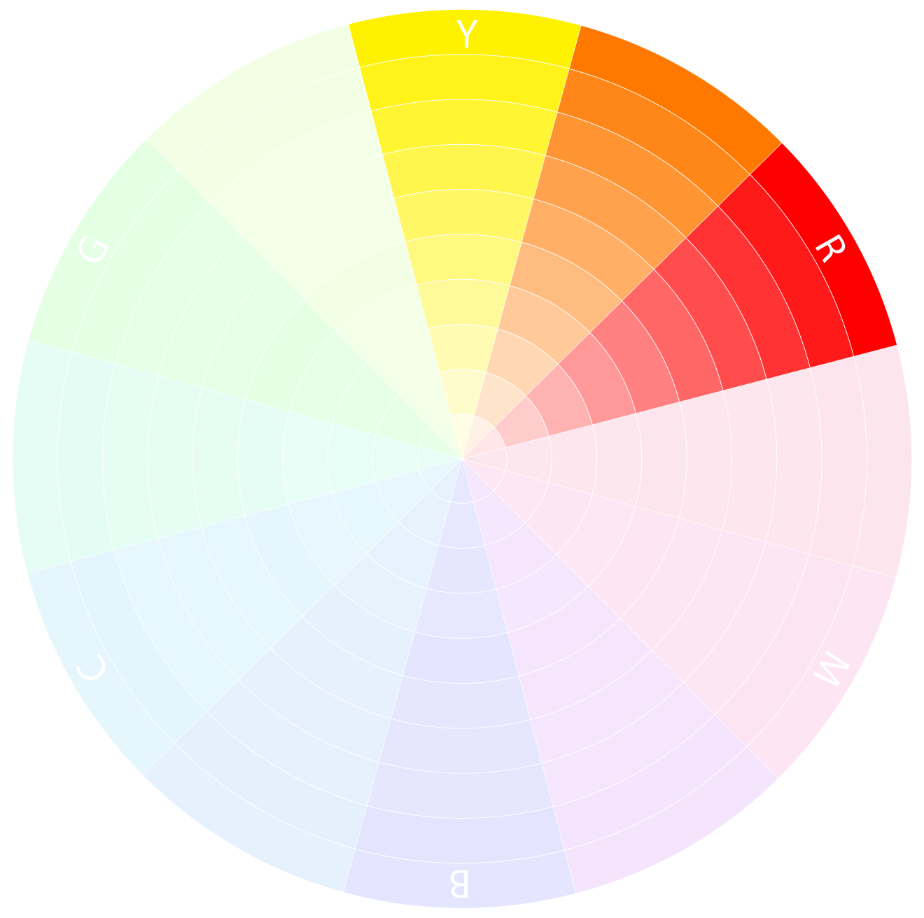
The complementary color scheme is one of the most popular schemes out there, and for a good reason. Complementary colors are two colors opposite each other on the color wheel, and when used together, they create a really eye-catching effect.
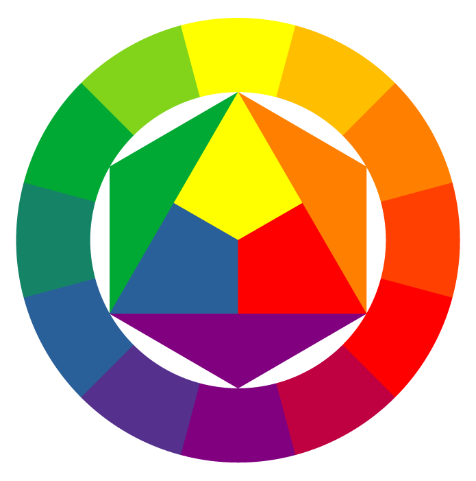
Split Complementary Color Scheme
A split complementary color scheme uses three different colors. The main color, another color directly across from it (the complementary color), and a third colour that is next to the complement. This scheme is perfect for projects that need a pop of color.
Triadic Color Scheme
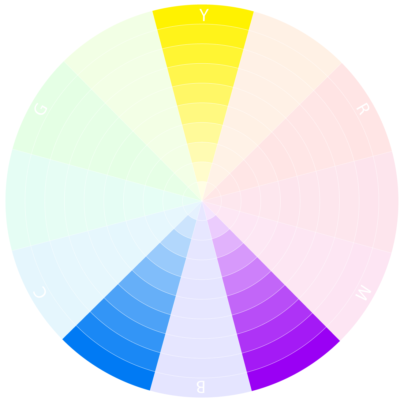
The triadic color scheme is another popular scheme that uses three evenly spaced colours around the color wheel. This scheme is perfect for projects that need lots of color. This is a more advanced color scheme because it can be tricky to keep a good balance between all the colors.
Double Complementary Color Scheme
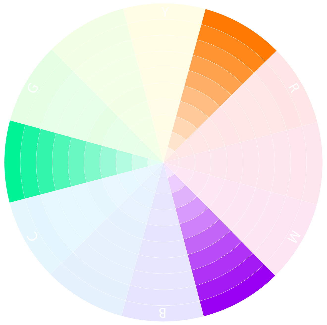
Also known as a tetradic color scheme, the double complementary scheme is even more complex than a triadic one because it uses four colors. These are usually two sets of complementary colors that are exact opposites. This scheme is perfect for projects that need lots of color and visual interest.
Balancing Colors
Once you have picked a color scheme you might be wondering how much of each color you should use, which colors should be more saturated and which shouldn't, or how to translate what you see on the color scheme to a working color palette in the first place. The good news is that color theory is as much of a science as an art, and science has some set rules that work virtually all the time!
Let's look at some of those guidelines together.
Choose a Primary Color
The first thing you need to do when creating a color scheme is to choose a primary color. This is the color that will dominate your design, and you can use it in 60-80% of your project. The other colors in the scheme will support and accent colors to add interest.
Mind Your Saturation
Keep your highest saturation level for the focal point of your image or design, and then use lower saturation levels for the secondary and tertiary colors. This will help create a sense of hierarchy and order in your design.
Create Contrast
Contrast is key in any design, but it's especially important when using color. You want to make sure that your colors are different enough to create visual interest but not so different that they are jarring. A good rule of thumb is using light and dark, or warm and cool colors next to each other, with the highest contrast near the image's focal point.
Warm and Cold Colors
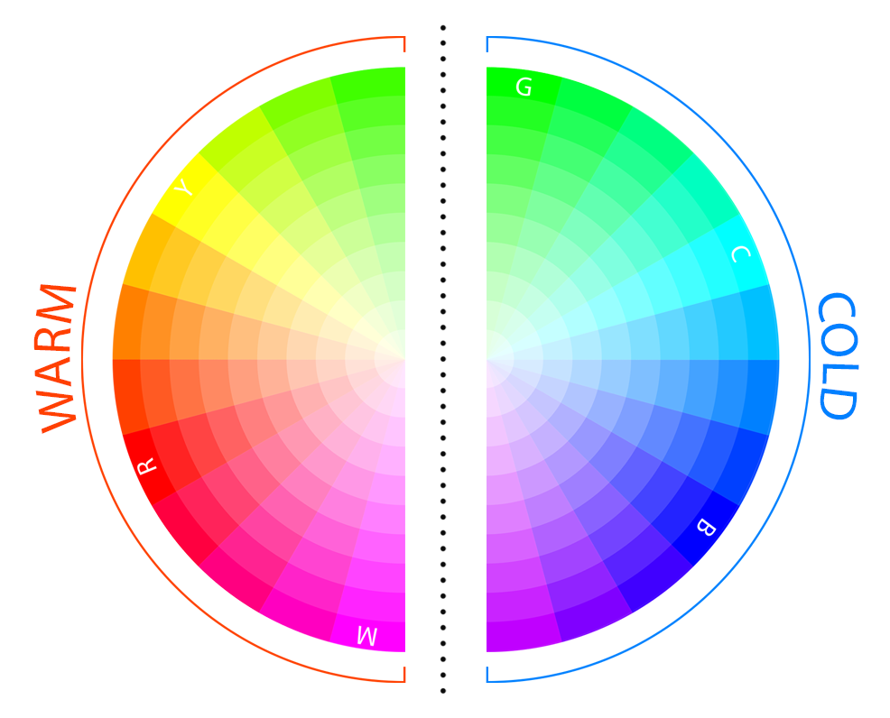
Another fascinating aspect of color theory is the difference between warm and cold colors. Warm colors usually appear to come from a fire or the sun and generally make things look more cheerful or active. Cool colors, on the other hand, are the colors of objects that we usually see as cold, like ice, water, and shadow areas. They give a feeling of coldness and stillness.
Warm Colors
Warm colors such as red, orange, and yellow can create an energetic or dangerous feel to a painting. They are often used to add drama or excitement. They can also come across as inviting, welcoming and full of life, and they generally attract the viewer's eye.
Cool Colors
Cool colors such as blue, green, and purple can create a calming or serene feeling. They often appear in paintings that evoke a sense of tranquillity. They can also come across as uninviting or sad. In general, they are less likely to attract the viewer's eye because cool colors recede, or move back in a painting, while warm colors come forward, stealing all the attention.
Check out my blog post on How to Effectively Use Warm and Cold Colors in Art for in-depth tips on how to use warm and cold colors.
Color Meaning in Art
A big part of color theory is understanding color psychology - the way different colors can affect our emotions, moods, and thoughts. Color psychology is a vast topic on its own, so we will only scratch the surface for this article.
If you are interested in learning more about this topic, I suggest checking out this post on the meanings of colors.
Here is a quick overview of a few of the most popular colors and what they mean in art:
Blue: Stability, peace, and tranquillity
Green: Prosperity, hope, and growth
Yellow: Happiness, warmth, danger
Purple: Royalty, spirituality, wisdom, magic and mystery
Red: Passion, Blood, Love, Aggression
Orange: Creativity, happiness, excitement
Pink: Kindness, love, youth, sweetness, naivety
White: Light, purity, Innocence, emptiness
Gray: Durable, neutral, old, lifeless, boring
Black: Darkness, elegance, power and authority
Brown: Earthiness, dependability, strength
Theory vs Practice
Now that you have learned the basics of color theory, it is important to learn how to apply it. This is where practice comes in.
It is important to note that color theory is not a set of rigid rules - it is more like a set of guidelines that can help you when making choices about color.
While it is essential to understand the theory of color, practice is the best way to learn about how colors work together and what effects they can create. Get your hands dirty and start testing with what you just learned. Try out different color harmonies and see what works best for you.
So experiment! Try out different color schemes and see what you come up with. Not everything will be a success at the start, but that's ok. As with any other art, you need a healthy mix of skill, practice, and play to grow.
Conclusion
Knowing how to harness color is a superpower, and you are now well on your way to becoming a color theory superhero! Don't be afraid to experiment and play around with different color combinations. The more you practice, the better you will get. And who knows, you might even create a masterpiece or two in the process!