How to Effectively Use Warm and Cool Colors in Art
Are you looking to create a more interesting and dynamic piece of art? If so, learning how to use warm and cool colors can help. In this blog post, we'll take a look at what warm and cool colors are, how to use them separately and together, and some tips for creating beautiful pieces of art with them. So whether you're just starting out or you're a seasoned pro looking to add a little more depth to your work, read on for some helpful advice!
Understanding The Difference Between Warm and Cool Colors in Art
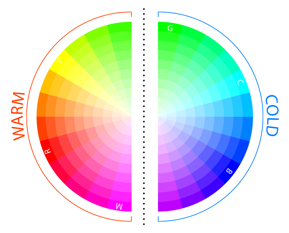
Before we dive into how to use warm and cool colors, let's first take a look at what they are. Warm colors are associated with heat, such as red, orange, and yellow. These colors tend to be associated with fire, the sun and blood. They are energizing and can create a feeling of excitement, movement or passion. On the other hand, cool colours are those that are associated with cold and night, such as blue, green, and purple. These colors tend to be calming and evoke feelings of peace or serenity but are also associated with stillness, despair and sadness.
Here is a little cheat sheet that you can use as a quick reference when working with warm versus cool colors:
Warm Colors
Warm colors definition in art: Warm colors on the other hand, are those hues that give the feeling of warmth, such as red, orange, and yellow. These colors are often associated with fire, the sun, and heat. They can make an area feel closer and more intimate and create a sense of energy or excitement.
Colors: Red, orange, yellow, yellow-green, magenta and red-violet.
Mood: Excitement, liveliness, joy, youth, anger, love or passion.
Association: Summer, fire, anger, movement and blood.
Property: They tend to be more advancing and vibrant and catch the viewer's eye.
Cool Colors
Cold colors definition in art: Cold Colors are hues that give the feeling of coolness, such as blue, green, and pale purple. These colors are often associated with water, grass, and sky. They can create a sense of distance and make an area appear further away. Cool colors can also make a space feel more serene and calming or be associated with sadness and depression.
Colours: Blue, cyan, blue-green, purple, and blue-violet.
Mood: Sadness, stillness, death, shadow, calm, tranquillity.
Association: Winter, ice, sleep, death, water, and the sky.
Property: They tend to be more receding and relaxing and create a sense of calm in the viewer.
If you're interested in learning more about color psychology and how it can affect your art, I have a blog post on the meaning of colors that you might find helpful.
Now that we know what warm and cool colors are, let's take a look at how to use them in your art.
Color Temperature in Art
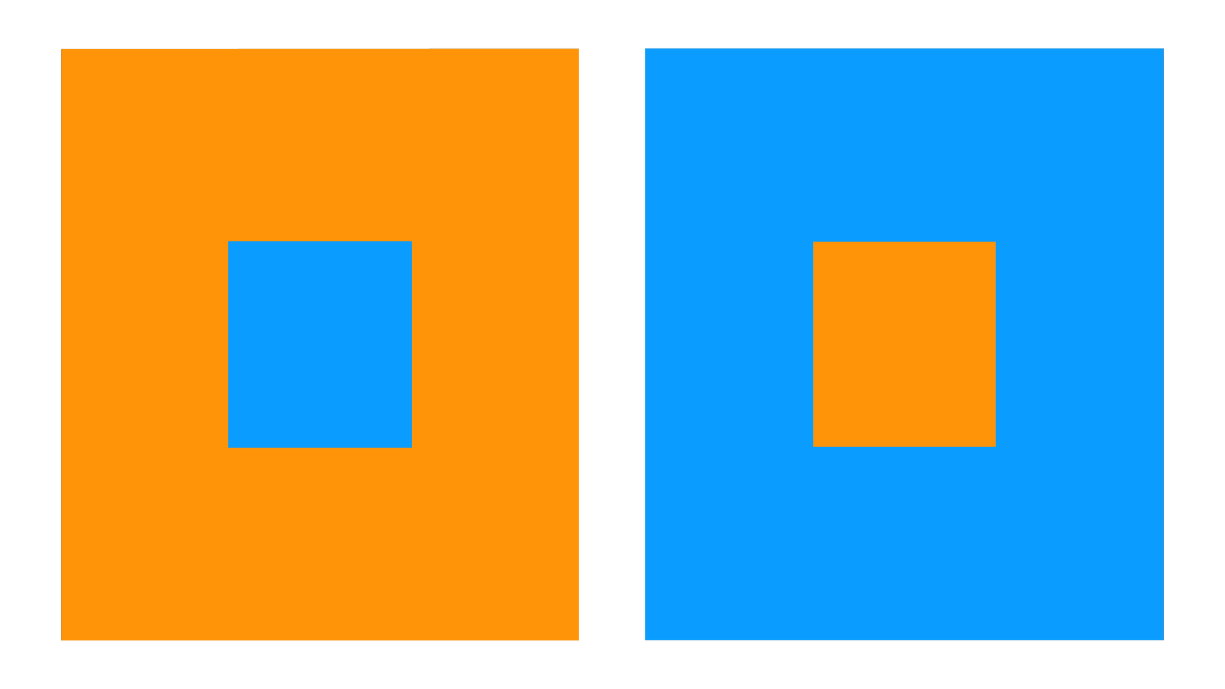
Color temperature refers to how warm or cool a color appears. The perceived temperature of a color is affected by its surrounding colors, as well as the light source. For example, a blue color may appear colder when surrounded by warm red. Similarly, a yellow may appear warmer in the sun than in the shade.
In the example below, you can see how the color temperature of the same blue changes depending on its surroundings.
In the example below you can see how the same color, in the middle squares, appears different depending on its surrounding color.

This means that although we can split the color wheel into warm and cold colors as we did before, we need to take it one step further when applying colors next to each other.
Is Grey a Warm or Cool Color?
Color theory tutorials always focus on pure colors, which can leave you wondering about hues like greys, neutrals and browns, so are these neglected colors warm or cool?
To answer this question, we have to briefly talk about saturation. Saturation is the intensity of a color, or how much white has been added. A color can be 100% saturated (also called pure or chromatic), meaning it contains no white and is very intense. At the other end of the spectrum, we have 0% saturation (also called achromatic), which means the color is made up of only white.
This means a grey color is neither cool nor warm. Its temperature depends on which pure hue it comes from. For example, a warm grey will be made up of warmer colors like red and yellow, while a cool grey will be cooler colors like blue and green mixed with white, grey or black. This applies to any color independently of its value and saturation.
So next time you are trying to figure out where a specific color sits on the color wheel, think about how that color would appear in its pure form before being mixed.
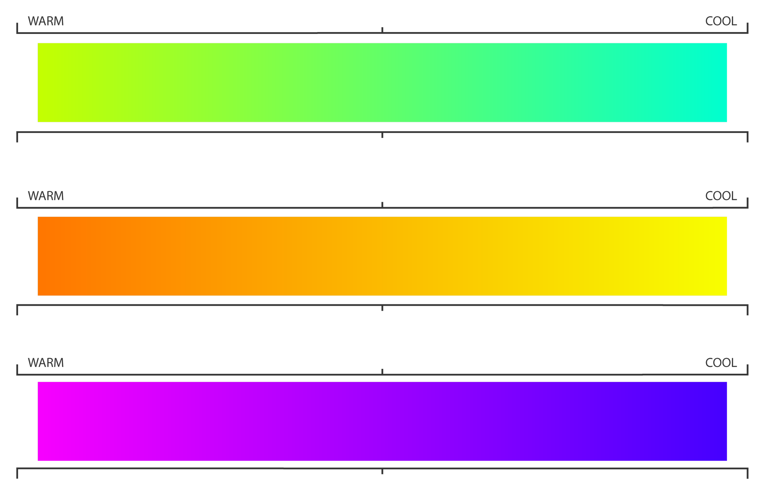
Cool Color Receeds and Warm Colors Advance
A fantastic trick to add more depth to your artwork is using cool and warm colors next to each other. This will create a visual effect in which the warm colors advance - or appear closer to the viewer, and the cool colors recede into the background.
In the example below, you can see how the blue appears to recede into the background while the orange seems to advance.
This is an extremely powerful tool that you can use to create a sense of depth and movement, and visual interest in your artwork.
When used correctly, warm and cool colors can help to create an illusion of space and depth in your artwork. However, if misused, it can create a jarring and disorienting effect. So be careful and take your time when experimenting with color temperature. It might take a lot of thinking and testing at first, but you'll get the hang of it in no time, and it will be worth it in the end!
How to Use Warm and Cool Colors in Art
Now that we know all about warm and cool colors let's look at how to use them in our artwork.
Use Warm Colors to Attract Attention
The focal point is the most important part of the piece and is where you want the viewer's eye to be drawn. You can use warm colors to attract attention to this area.
Use Cool Colors to Create a Sense of Space
If you want to give the illusion of depth or make an area seem farther away, you can use cool colors. This is because cool colors recede while warm colors come forward.
Use Warm or Cool Colors to Create Contrast
This will help to add more visual interest. For example, adding a warm colour will create contrast if you have a predominately cool color palette. Vice versa.
Be Mindful of Relative Color Temperature
Surrounding colors will always affect the appearance of their neighbouring colors. This means that you are not limited to reds, oranges, and yellows when picking a warm tone. A slightly more towards-violet blue could be the warmest color in your painting and still have all the properties associated with warm tones.
So if you stay mindful of the relative temperature of colors, you can have all the freedom you need to mix and match to create the perfect color palette for you.
Take Advantage of Color Psychology
Warm colors tend to be associated with happy and cheerful moods, while cool tones are often used to create a more sombre atmosphere.
You can use this symbolism to enhance the meaning behind each element of your illustration. For example, if you want to create a lively, happy character, your could dress her in warm tones or give her warm shades in her hair. And, if you put your red cape-wearing character into a cool-green forest bathed in dim, cool blue light, the whole atmosphere of the painting will communicate that she might be cold, lost and possibly in danger.
Try Using a Limited Color Palette
You can also accentuate the mood of a painting and create an even stronger reaction in the viewer. Try using a limited color palette consisting mainly of warm or cool hues.
As you can see, there are many ways to effectively use warm and cool colors in your artwork. By understanding the effects these colors have on viewers, you can create more meaningful and impactful pieces. So experiment with different color combinations and see what works best for you.
Conclusion
This might feel like a lot of information, but, like anything, with a little practice, you'll get the hang of it in no time. Once you get familiar with color theory, you'll feel motivated to experiment and have the confidence to pick beautiful colors for all of your artwork, and that's when the real fun begins!
If you're interested in learning more about how to use color, I suggest checking out my introduction to color theory post. This will give you a more in-depth look at the different properties of color and how to use them in your artwork.
Color theory is a powerful tool, and understanding the basics will give you a solid foundation to build on as you continue your journey as an artist.
I hope this article helped you understand warm and cool colors. If you have any questions, feel free to leave a comment below. Happy creating!